Mar
2025
15

The great movement to the left
At Blue Dots, we constantly analyze how to segment customers based on their revenue and profit contributions over time. A key part of this process involves running a simple, yet powerful analysis for a given period of time (for example in 2024):
- On the horizontal axis, we rank all customers from the highest revenue generator to the lowest.
- On the vertical axis, we plot the cumulative percentage of total revenue contributed by these customers.
Understanding the Graph
Let’s take an example. Suppose a company generated $20M in revenue in 2024, and its top three customers contributed $1M, $0.8M, and $0.5M, respectively. Their combined revenue of $2.3M accounts for 11.5% of the total revenue. This means the first customer’s data point is (1, 5.0%), the second is (2, 9.0%), and the third is (3, 11.5%).

Another way to interpret this graph is to set a revenue threshold—say $100,000—and identify all customers that collectively meet this target. All customers to the right of this threshold collectively generated less than $100,000. This allows businesses to visualize customer concentration and identify low-value customers.
The Ideal Distribution
In a perfect world, every customer would contribute the exact same revenue, forming a straight diagonal line (the green line). However, in reality, revenue distribution is skewed. Businesses selling multiple products will always see variations in customer contributions. To get a more accurate view, this analysis should be run for each product line separately.
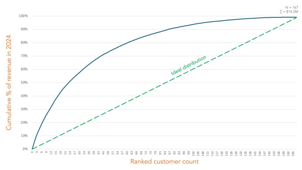
Mathematically, the curve is always concave—that’s because cumulative revenue never decreases. The deviation from the perfect diagonal line can be measured by comparing the area under the actual curve with the ideal scenario. The worst-case situation? A single customer contributes almost all the revenue while the rest add negligible value. The curve would be the two smaller sides of an almost perfect triangle.
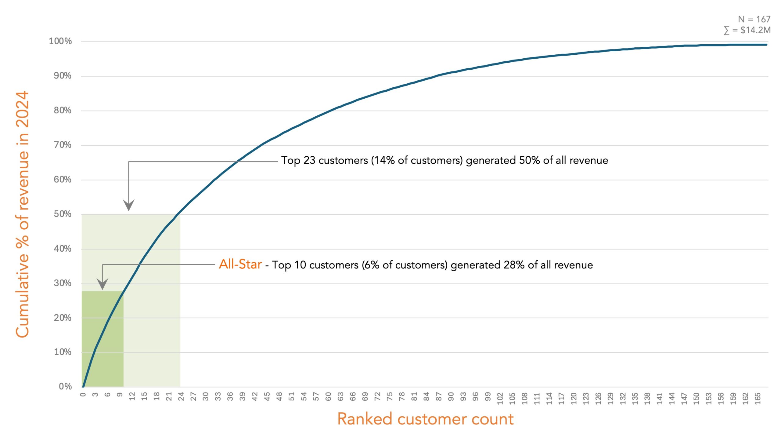
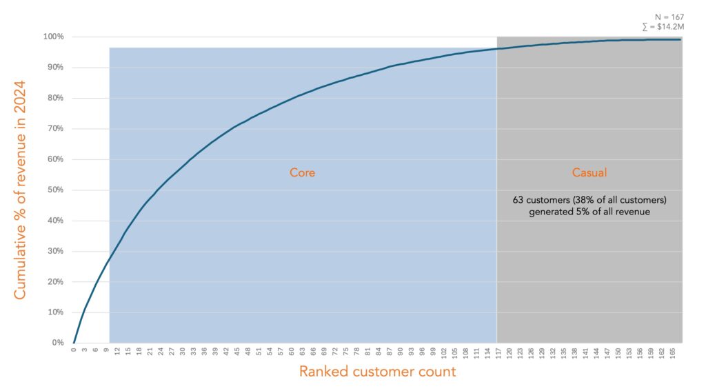
Categorizing Your Customers
When analyzing customer concentration, we typically classify customers into three groups:
- All-Star – Your top-tier, high-revenue, ultra-engaged. These high-value customers contribute a significant portion of revenue (e.g., 10% or more). They are critical to the business, requiring strong relationships with the executive team. These customers may also shape future product development. We call these the “Shaping Customers.”
- Core – Reliable, mid-tier customers who keep things running strong. Together, they generate around 80% of revenue. They form the backbone of the business and need consistent engagement to minimize churn.
- Casual – Occasional customers who drop in but don’t spend much. These are low-revenue customers collectively generating a total of 10% or so of all revenue. They tend to consume resources disproportionately. Some of them are vocal and many are unprofitable.
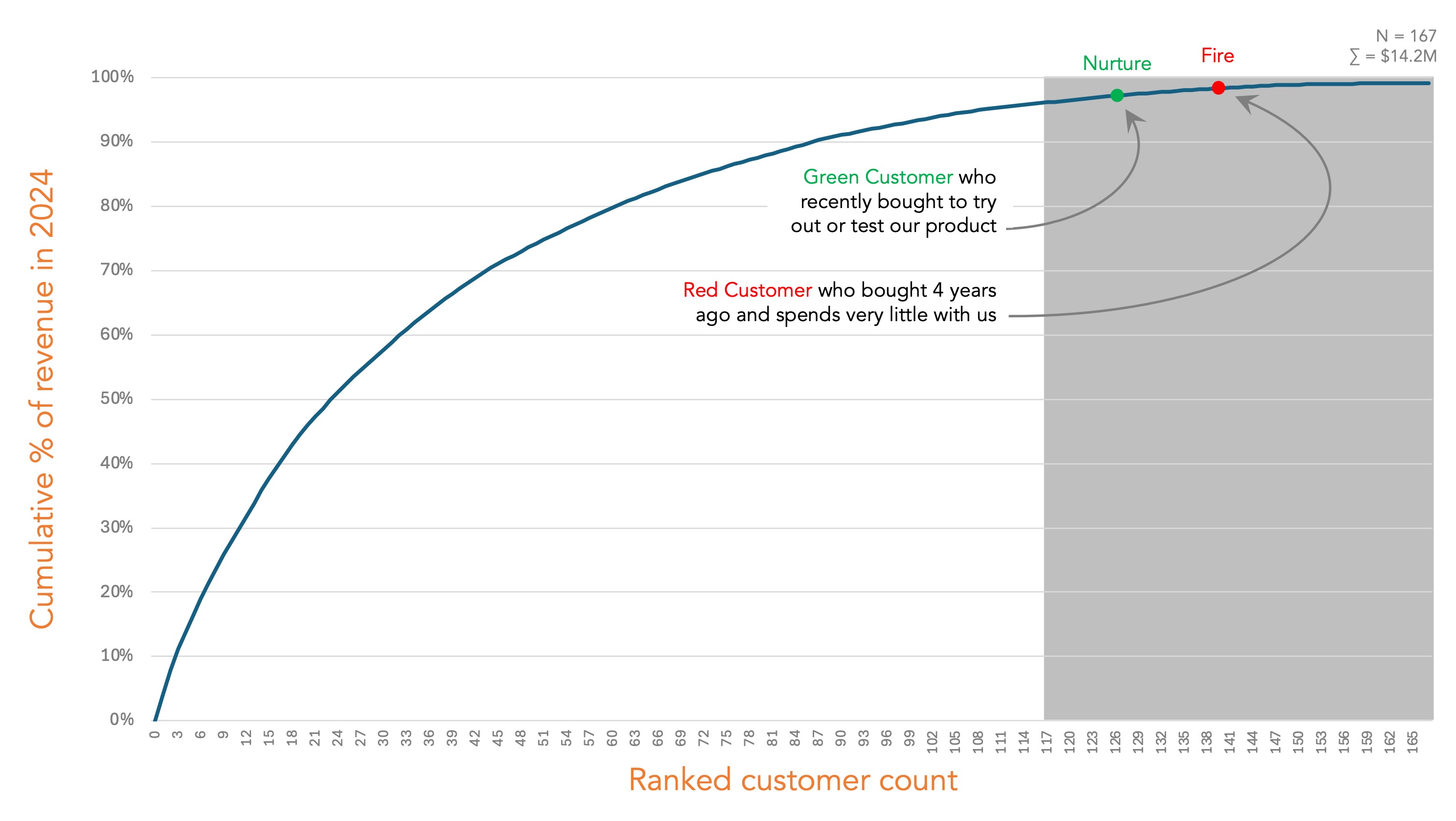
What to Do with Casual customers?
The answer: Move them out or move them to the left of the curve. At Blue Dots, we call this strategy the “Movement to the Left.”
Here’s how it works:
- Raise prices significantly (e.g., 3–5x) when these customers renew or make a new purchase.
- If they accept, their revenue contribution increases, pushing them leftward on the curve.
- If they leave, that’s okay—the goal is to eliminate unprofitable and low-revenue contributing customers.
The Exception: Green Customers
Not all small customers should be dismissed and you should proceed with caution. New customers often start with smaller purchases as they may test the product. They need nurturing, not elimination, to encourage long-term loyalty and higher spending.
Refining Your Business Strategy
To get the most out of this analysis:
- Compare year-over-year graphs – Are you focusing more on high-value customers over time? Ideally, the curve should shift closer to the diagonal green line each year.
- Color-code customers by cohort – If newer customers cluster in the “Casual” section, that may be acceptable. But if long-term customers remain unprofitable, it signals a deeper issue.
Conclusion
This analysis isn’t just about numbers—it’s about strategic focus. By identifying which customers truly matter, businesses can allocate resources more effectively. One of the greatest lessons I learned from Steve Jobs is that success isn’t about being focused—it’s about being hyper-focused.
So, take a close look at your customer base. Are you spending time and focusing on the right ones? Is the movement to the left?